 PawStyle Daily
Cute Pet Wallpaper 4K
Dog Valentine Coloring Pages to Print at Home
A dog Valentine coloring page is the gift that takes an evening to make and a decade to be remembered by. The printer does the outline, the crayons do the love, and the finished page becomes a card, a framed keepsake, or the art on the fridge that beats anything bought. This page walks the designs worth printing, the paper and ink settings that keep the lines crisp under a crayon, the color stories that suit heart-shaped pups, and the five uses a finished page can become before February arrives.
By PawStyle Daily · Updated 20 November 2026
Heart-and-pup designs in two detail levels · matte paper for crayons, cardstock for cards · print at actual size · fold, frame, scan, or gift.
Why a printed coloring page lands in February
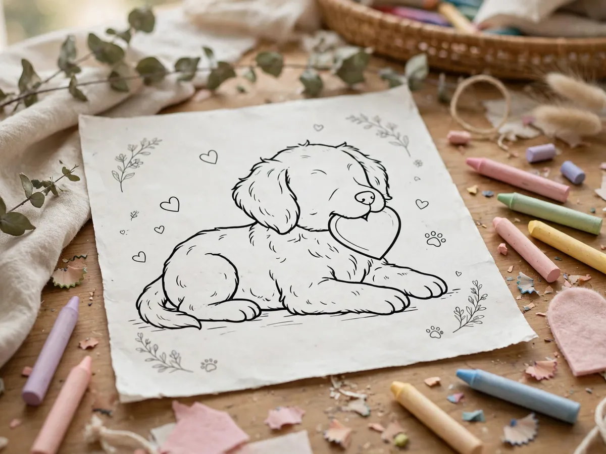
The Valentine aisle sells cards that say nothing in particular about anyone. A coloring page the household prints and a child fills in says everything: the dog's actual colours, the heart in the dog's mouth, the wobbly "Be My Valentine" written in pencil underneath. The handmade line is the reason the page survives the season - store cards get recycled after the 14th, and the colored page gets the fridge door, the school mailbox, or the grandparent's shelf.
The print-at-home part is what makes it fast. No shipping deadline, no minimum order, no waiting on a craft store aisle in February crowds. A printer, a sheet of paper, and a box of crayons cover the whole project, and the pages print in the same session as the rest of the season's crafts. The design bank is the only real shopping - and the year-round collection on the cute dog coloring pages page carries the same pups without the hearts, so the Valentine set joins a library the household already owns.
The pages also work for the quieter side of the season. A Valentine without a pet - after a loss - runs the other direction, and the coloring page works there too: something to do with the hands on the 14th, a dog on the paper because the dog belongs on it. The a first Valentine without a pet page holds that whole conversation, and the coloring page is one of its gentlest pieces of company.
The designs worth printing
The heart-carrier is the headline design: a puppy with a heart in its mouth, looking up as if offering it. The line art wants one clear subject, a heart big enough to color without tiny spaces, and a face with the expression already drawn in - the tilted head, the soft eyes, the tail suggested by a single curve. This is the page that becomes the card, so it earns the heaviest paper in the stack.
The wreath design is the second: a dog's face inside a ring of hearts and leaves, the classic Valentine shape with the pup at its center. It suits the frame better than the card - the round composition hangs well - and its small leaf spaces suit coloured pencils over crayons. The pair-of-pups design is the third: two dogs, one heart between them, the composition built for the message "from me to you," and the version classrooms trade on the 14th.
The detail level decides who colors what. Simple outlines with thick lines suit small hands and fat crayons - the heart-carrier and the pair-of-pups both come in this cut. Detailed line work with small hearts, patterned collars and mandala-style fills suit coloured pencils and the adults who claim they are "just helping." Printing one of each level means the whole table colors together, each in their own lane, and the stack that leaves the printer covers every hand in the house.
The text space is the design feature nobody notices until it matters. A page with an empty banner under the pup - "BE MY ___" - lets the child write the dog's name and turns the coloring session into a personalised card without any extra craft. The bannerless pages suit the frame route better, where handwriting would compete with the line art. Checking for the banner before printing is the ten-second decision that sorts the stack into cards and frames.
Paper and ink settings that keep lines crisp
The paper is the first decision. Standard matte printer paper handles crayons fine and costs the least, and it is the right sheet for the classroom-trade designs that get handed out in quantity. The heavier cardstock - the same sheets the greeting card guide on this site runs - is the right sheet when the finished page becomes a card or a frame, because it folds on the score line without cracking and stands up to pencil pressure.
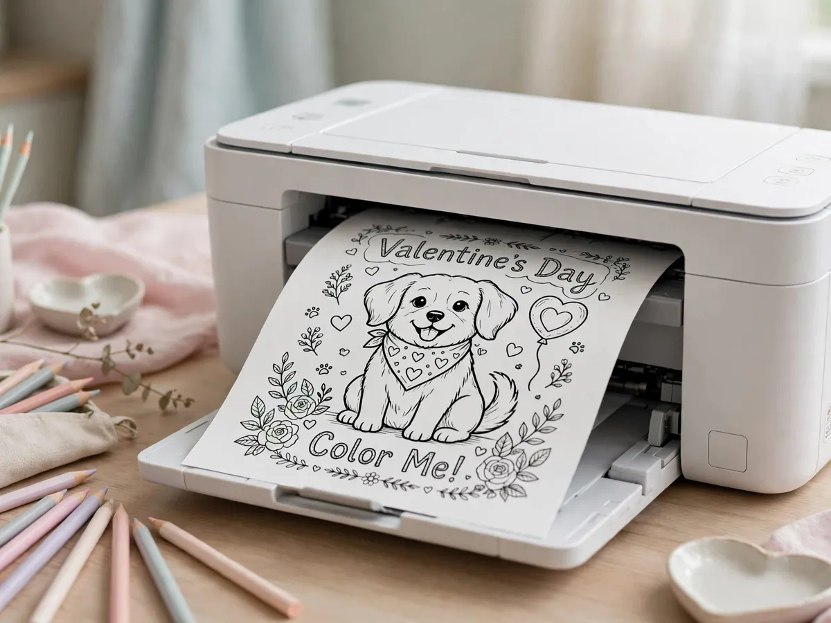
The ink setting is the piece most households skip. Line art wants the black-and-white or grayscale setting, not color - color mode lays three cartridges under a single black line and leaves the page damp, which smears under the first crayon stroke. Draft mode thins the lines; actual-size, normal quality keeps them even. And the page prints upside-down relative to the tray on some printers, so one test sheet before the good cardstock settles the orientation question for the whole session.
Grayscale also matters for the crayon reason: a crisp dry line gives crayon and pencil something to grip. Inkjet lines laid heavy stay slightly glossy, and wax crayon slides over them without depositing colour. The fix is a light pass - normal quality, not high - and a five-minute dry before the box opens. Laser printers skip the whole problem: their lines fuse dry, and the crayon grabs from the first stroke.
The session runs one batch at a time, and the batch is sorted by destination before the first sheet feeds. Cards on cardstock, trades on matte, frames on cardstock - three piles coming out of the tray, each headed to its own use. Printing everything on the fancy paper doubles the cost of a classroom stack; printing everything on the cheap sheet ruins the card that meant something. The sort is the setting that saves both money and the gift.
Color stories for heart-shaped pups
The pastel palette is the house style and the easiest win: blush pink for the hearts, cream and tan for the pup, sage green for the leaves, and a navy accent on the collar. The set reads soft at fridge distance and photographs well, which is the test every finished page eventually faces. Crayons lay pastel colour with light pressure, and the pale strokes keep the black line visible - the line art is the design, and the colour fills around it rather than over it.
The bold route owns the opposite: candy red hearts, saturated orange for a corgi, hot pink tongues. It suits the classroom-trade pages, the ones built to be noticed in a pile of thirty. The rule that keeps bold from muddying is layering order - light colours first, dark last - because a dark stroke dragged over a pale one carries the pigment sideways. The same rule saves the pastel set: pink before navy, cream before brown, hearts last of all.
The breed-true version is the third story, and it is the one that makes gift recipients say the actual name of their dog. The golden gets cream and gold, the husky gets grey and white with the navy mask, the frenchie gets fawn with the pink bat ears. Colouring the page to the real dog on the couch turns a generic Valentine into a portrait in crayon, and it is the move the grandparents notice first. The reference photo goes on the table beside the page, and the match is the game.
Five things a finished page becomes
The card is the first use and the fastest: fold the page on a scored line, and the colored side faces out. The inside takes one handwritten line - the child's version of "Be My Valentine" beats any printed sentiment - and the envelope seals the project. The cardstock pages carry this best; the matte-paper pages tear at the fold and belong to the second use instead.
The frame is the second use, and the one that outlives February. A thin gold frame on a blush wall turns the crayon work into gallery art, and the shelf above it takes the dog's photo beside the page. The third is the scan: a phone scan of the finished page travels to the grandparents the same night, and the printed copy mails behind it. The fourth is the gift-tag row: the small designs cut down to tag size, a hole punched at the corner, twine through it, and the Valentine cookies get their labels.
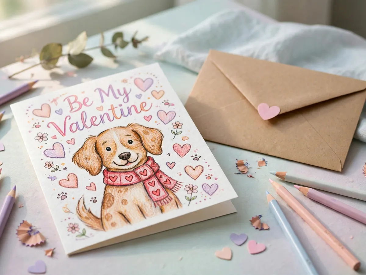
The fifth use is the yearly one. The pages stack in a folder by year - 2026's golden, 2027's corgi - and the folder becomes the craft the household repeats every February with the same crayons worn down to stubs. The stack is the growing portrait gallery of every dog the household has loved, colored by the hands that knew them, and it is worth more on the shelf than any commissioned frame. Print two of every design: one to give, one to keep in the folder.
Questions about dog Valentine coloring pages
What paper should I print coloring pages on?
Standard weight matte paper for crayons, and a heavier cardstock when the finished page becomes a card or a frame.
Can adults enjoy these pages too?
Yes. Detailed line work with small hearts suits coloured pencils, while simpler outlines suit crayons and kids.
What do I do with a finished page?
Frame it, fold it into a card, or send it as a scanned photo. The pages that get kept are usually the ones a child colored.
Save these on Pinterest
Pin the coloring guide before the February rush, or send it to a friend whose kids ask for dog art every Valentine. The Pet Art & Wallpaper collection holds the year-round coloring library, the Christmas pages that run the same print settings, and the portrait ideas that pair with a framed crayon original, so the craft shelf stays full all year.
For informational purposes only.